


You learn the alphabet in one Georgian font, the one your app or your flashcards happened to use, and it feels solid. Then you walk down Rustaveli and a shop sign is in letters you half recognize, an Instagram caption uses a rounder ლ than you have ever seen, and a headline appears to be written in a completely different script. Nobody warned you that a Georgian font could do that.
This post is the warning, late. It covers which fonts you already own, why the letters move around between them, and what those tall headline letters are.
You already have one
The first thing to know is that the search for a Georgian font is usually a search for something you have had all along. Every current operating system ships at least one font that covers Georgian.
Windows has had Sylfaen since the late 1990s, a font Microsoft commissioned specifically to cover Armenian and Georgian, and it is still the workhorse. The modern Windows interface font, Segoe UI, covers Georgian too. Apple ships SF Georgian as part of its San Francisco system family, on Mac, iPhone and iPad alike. Android and the whole of Google’s ecosystem use Noto Sans Georgian, which is also free to download from Google Fonts along with its serif sibling.
So if you can see Georgian letters on this page, you have a Georgian font. If a website or app shows you boxes instead of letters, that app is forcing a font that lacks Georgian glyphs. The fix is on their side, not yours, and I cover the typing side of this in how to type in Georgian.
Why the same letter looks different in every font
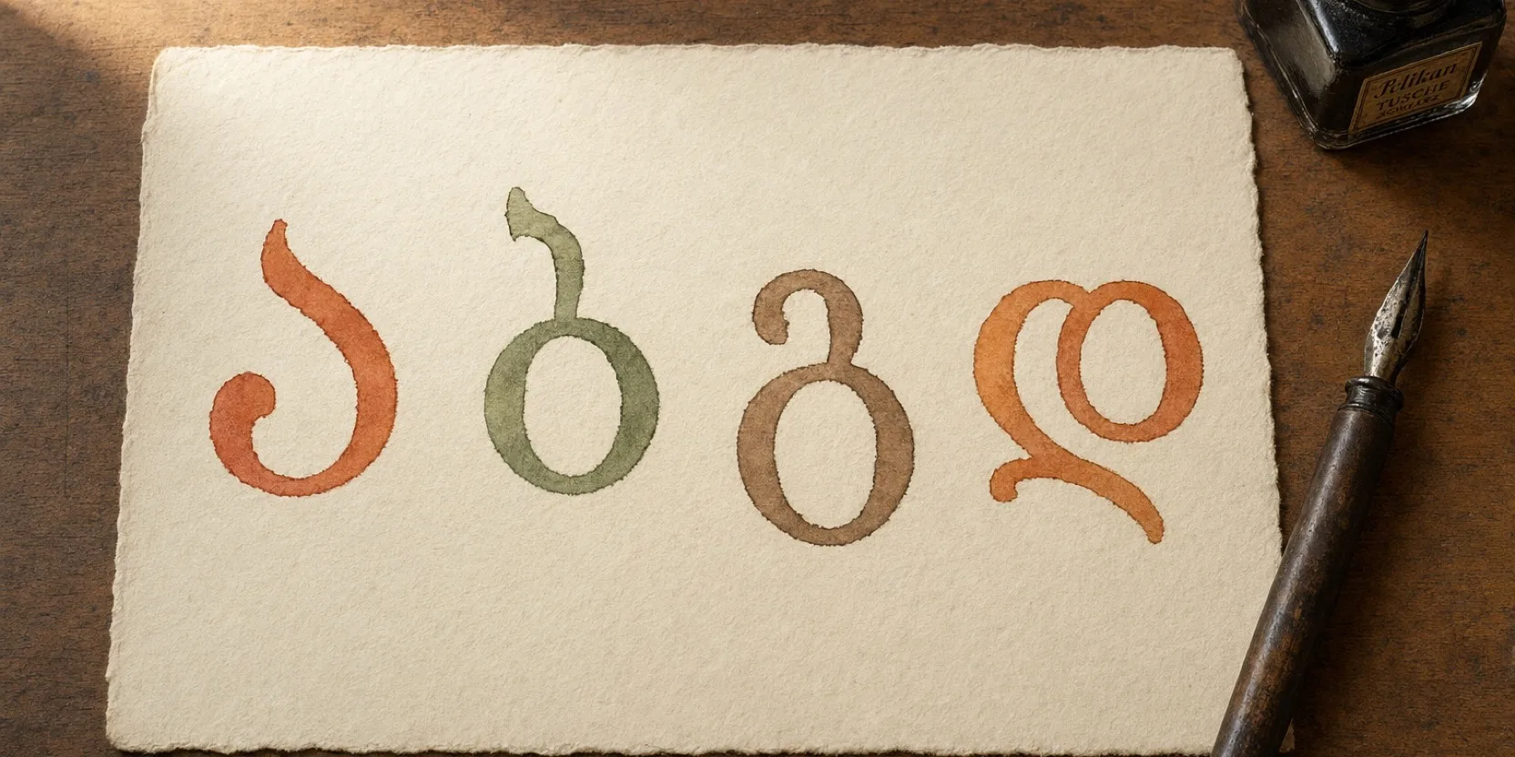
Mkhedruli, the modern Georgian script, is built out of loops, arcs and long curling tails, and it has more room for a designer’s interpretation than the Latin alphabet does. A Latin a is a bowl and a stem in nearly every font. A Georgian ლ can be three arches, two arches, or one flowing wave, depending on who drew it, and all three are the same letter.
The letters that move the most are the ones with the most curves. ლ and რ, with their multiple arches. დ, with its loop that some fonts open and some close. ჯ, which can look like a crossed stem or a hooked X. ე and ო, whose bowls stretch or squash. Font designers simplify the same letters that people simplify when they write quickly, and for the same reason: those are the letters with something to simplify.
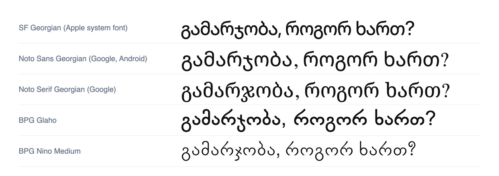
The same sentence, hello, how are you, in five fonts you will actually meet. Watch what happens to რ, ლ, ჯ and ხ from one row to the next.
This is not a flaw in Georgian typography. It is a script with a lot of character, and its type designers use it. But it means the learner who has only ever seen the alphabet in one font has learned one drawing of each letter, not the letter itself, and the first different font feels like a betrayal.
Mtavruli: the capitals that are not capitals
The headline that looks like a different script is Mtavruli, and it deserves its own section because it throws almost everyone.
Georgian has no capital letters. Sentences start with the same letter shapes they contain, names get no big letter, and the Georgian alphabet you learned is the whole alphabet. But Georgian typography does have an all-caps form, Mtavruli, in which every letter is redrawn to the same height, with no ascenders or descenders, so a word looks like a row of uniform blocks. You see it on shop signs, on posters, in headlines, in a caption someone wants to shout.
The rule is simple and strict: Mtavruli is for writing a whole word or heading in capitals. It is never used for the first letter of a sentence or a name, the way English capitals are. A Georgian word is either all Mtavruli or none.
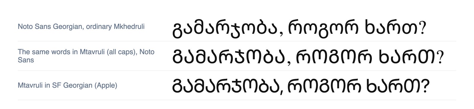
The top row is the sentence as you learned it. The two rows below are the same letters in Mtavruli. Nothing about the spelling changed, only the height and the shapes.
For a long time these forms were treated as a font trick, a style applied to normal letters, and it was only in 2018 that Mtavruli got its own characters in Unicode, which is why some older fonts cannot display it and some older text has it faked. The historical background, where these forms descend from the oldest Georgian script, is in the post on the three Georgian scripts. For reading purposes, the practical tip is this: when a sign looks like an unfamiliar alphabet with every letter the same height, it is Mtavruli, and it spells an ordinary word. Read it letter by letter and the shapes map back to the ones you know, mostly stretched or compressed to fit the line.
The fonts worth knowing by name
You do not need to install any of these to read Georgian. You might want to know them if you are setting up a document, a website, or a phone that stubbornly shows Georgian in an ugly fallback.
| font | where you get it | note |
|---|---|---|
| Sylfaen | ships with Windows | the classic, designed for Georgian and Armenian in 1998 |
| Segoe UI | ships with Windows | the modern Windows interface font, covers Georgian |
| SF Georgian | ships with macOS and iOS | Apple’s system font, includes Mtavruli |
| Noto Sans Georgian | Android, Google Fonts (free) | the neutral modern default, what this site uses |
| Noto Serif Georgian | Google Fonts (free) | the serif companion, good for long reading |
| BPG family | fonts.ge (free) | Georgia’s own large family of free fonts, many with Mtavruli variants |
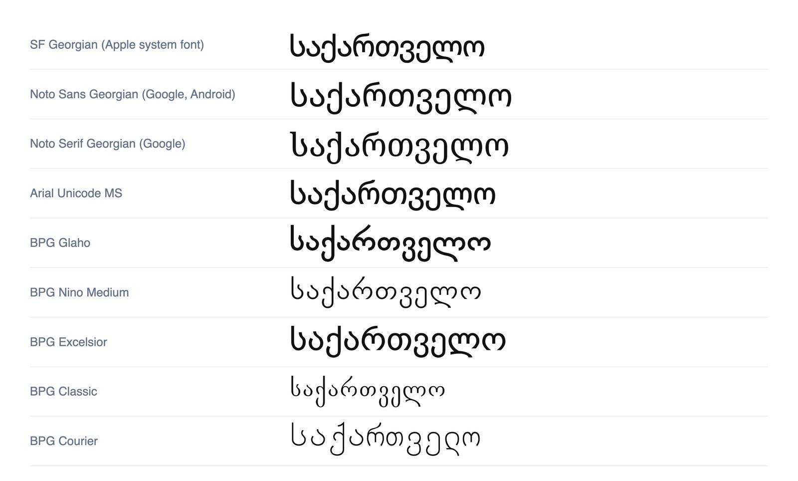
One word, საქართველო, Georgia, in nine fonts. The BPG rows are from the GPL-licensed BPG package that ships with most Linux systems, which is the same family behind a great deal of printed Georgian.
Two notes on that table. First, the BPG fonts deserve a special mention, because they are the fonts Georgia made for itself, hosted on fonts.ge alongside hundreds of others, and a lot of what you see printed in the country is set in one of them. Second, if you care about Georgian type as design rather than as a reading problem, the foundry Typotheque has spent years building a collection of more than thirty Georgian font families, and its essays on the script are the best writing on Georgian typography in English.
For what it is worth, this site self-hosts a subset of Noto Sans Georgian. We did it so that Georgian renders in the same clean face everywhere on the page, including inside italics, where system fonts used to swap in something harder to read. The free alphabet tool shows the letters in that font and then in photographs of real Tbilisi signs, which is deliberately two different drawings of each letter, for the reason the next section explains.
When Georgian looks wrong on your screen
A few specific failures, and what they mean.
Boxes or question marks instead of letters. The app is using a font with no Georgian glyphs. Your device has one, the app is not using it. Paste the text somewhere else and it will appear.
Georgian in a font that looks nothing like the alphabet you learned. Probably a fallback font your system picked because the page did not specify one, or a decorative BPG face the designer chose. Neither is wrong. It is a different drawing of the same letters.
A word in tall, uniform, capital-looking letters. Mtavruli. Read it as a normal word.
Georgian text where one or two letters look broken or oddly spaced. Usually an older font rendering the newer Mtavruli characters badly, or a font that covers most of the alphabet and not all of it. Rare now, and fixed by any of the fonts in the table.
How a learner should handle font variation
The instinct, after reading all this, is to go and learn every font’s version of every letter. Do not. That is the chart-memorization instinct, and it works about as well for fonts as it does for grammar, which is to say slowly and joylessly.
What actually makes font variation stop mattering is reading Georgian in more than one place. A menu in one font, a bus timetable in another, a friend’s message in the phone’s default, a headline in Mtavruli. Each one is a small reading test with the answer usually obvious from context, and after enough of them your eye stops seeing fonts and starts seeing letters. This is the same thing that happens with spoken Georgian at speed: the pattern goes in through volume, and it goes in faster than any chart could put it there.
So learn the alphabet once, in one clear font, in one afternoon. Then read everything, everywhere, in every font Georgia throws at you. The first Mtavruli sign that you read without pausing is a small, real milestone. Take it.